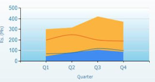
You can make the starting point of a the X-Axis as the Y-Axis in an Area Chart of SQL Server Reporting Services easily. Initially the Chart will be as shown below.
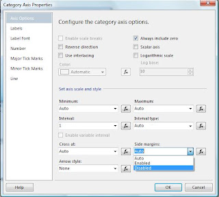
First right click on the the X-Axis and select Axis Properties.
Then you will get the "Category Axis Properties" window and change the Side margins property to Disabled as shown below.
It will do the task and you will get a chart as shown below.
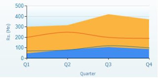
That's all...
Business Intelligence, Data Warehousing, OLAP Implementation, Reporting and many more...
Subscribe to:
Post Comments (Atom)
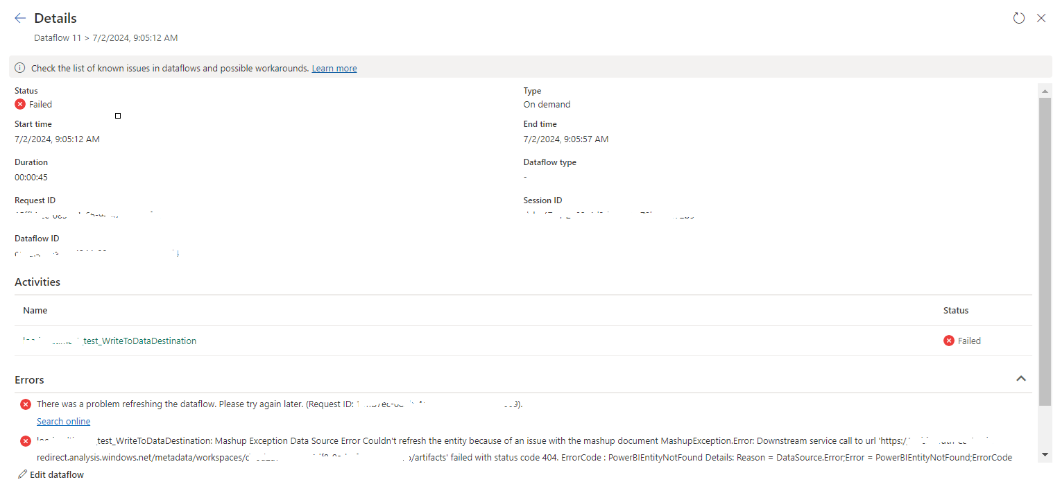
tablename_WriteToDataDestination: Mashup Exception Data Source Error Couldn't refresh the entity...
Once a Dataflow is created and published on Fabric, got the below error while refreshing the Dataflow. tablename_ WriteToDataDestination: M...
-
In SQL Report Subscription, you may want to send the report with the link and you can do it by selecting Include Link value. But some time...
-
In SQL Server Analysis Services Cube, there may be a situation where we need to combine two related fact tables. This kind of a situation ma...
-
When I tried to connect to a SharePoint URL in dashboard designer options, it prompt a message saying "The URL is not available, does n...
No comments:
Post a Comment