
You can change the appearance of the chart and make it more attractive by changing the chart properties.
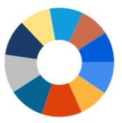
Some of the attractive doughnut chart are shown below.

Figure 1

Figure 2
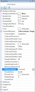
To change the doughnut chart as shown in Figure 1, go to the chart series properties window.
Then expand the CustomAttributes and set the PieDrawingStyle to Concave as shown in below figure.

To change it as to shown in Figure 2, just change the PieDrawingStyle to SoftEdge.
By doing that we can make our doughnut chart more attractive.


No comments:
Post a Comment